Posts
Branding, Website and Studio Refresh
/0 Comments/in Assorted, Commercial/by Sarah DeaneThis year has seen some big changes at my photo studio and the way I approach my work. As I am now non stop with corporate photography Monday to Friday I have restricted my weekend work and ceased wedding shoots altogether. It’s exactly where I aimed to be so I’m delighted and have celebrated with an updated logo to reflect my focus on Commercial Photography. This all celebrates 7 years in business which feels fantastic!
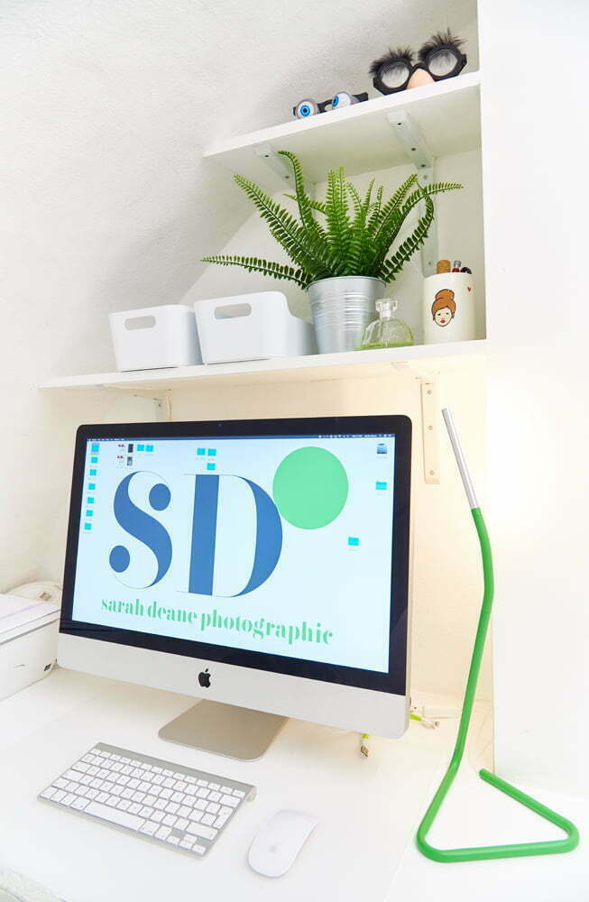
London based Studio hb who had designed my original branding were briefed to update the typeface to something very ‘me’. A new fresher tone of green has replaced the old and we have ridded of the black and dark greys and switched to a fresher cleaner white. The new font Bella Regular has a similar friendly, approachable and creative feel to the last, but with a new simplistic SD and circular icon. I love its newness and to me it represents progression and celebration that I am still here 7 years on! Hurray! The new logo is now stripped though my website, my marketing materials and up on my studio walls so have a gander and see what you think…
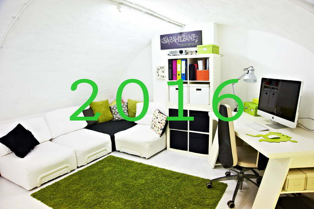
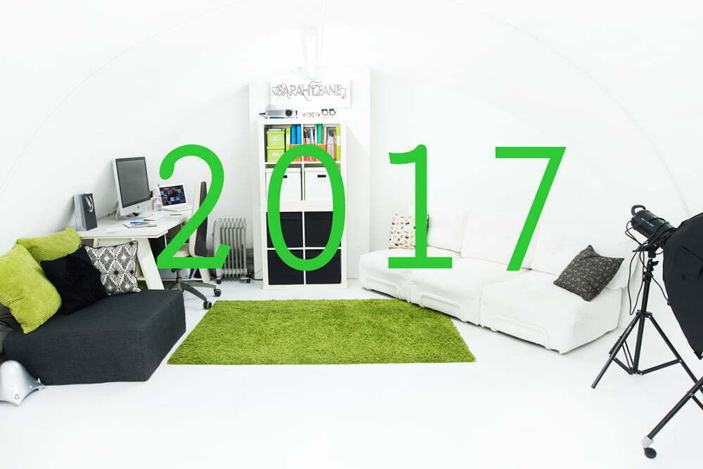
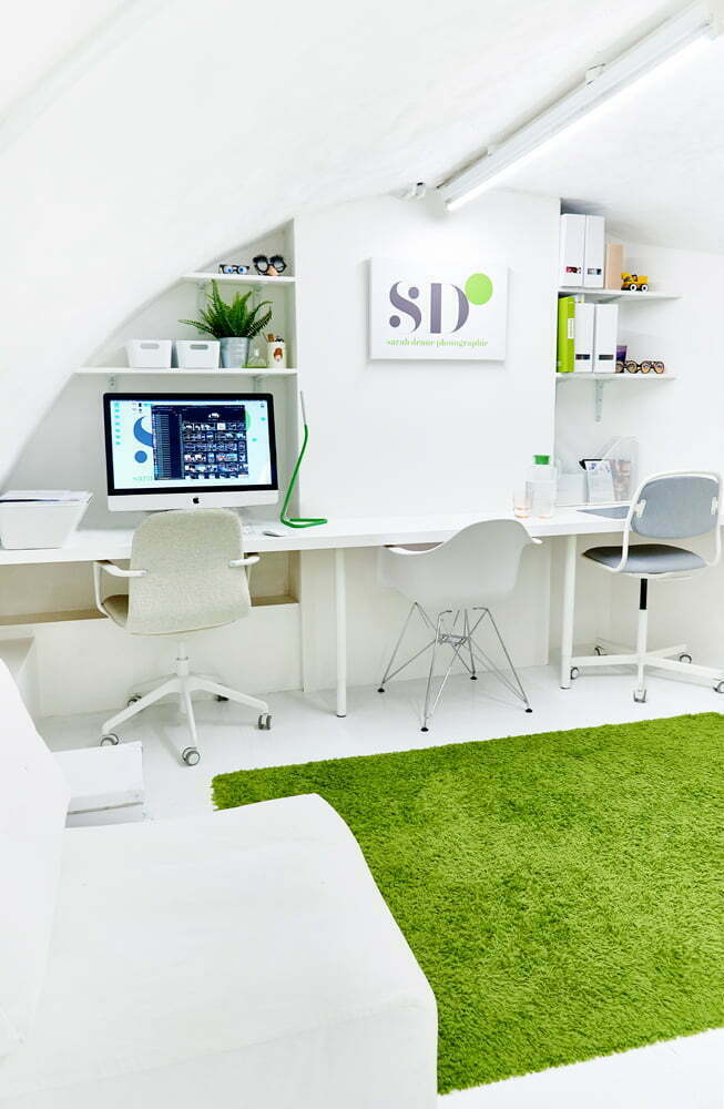
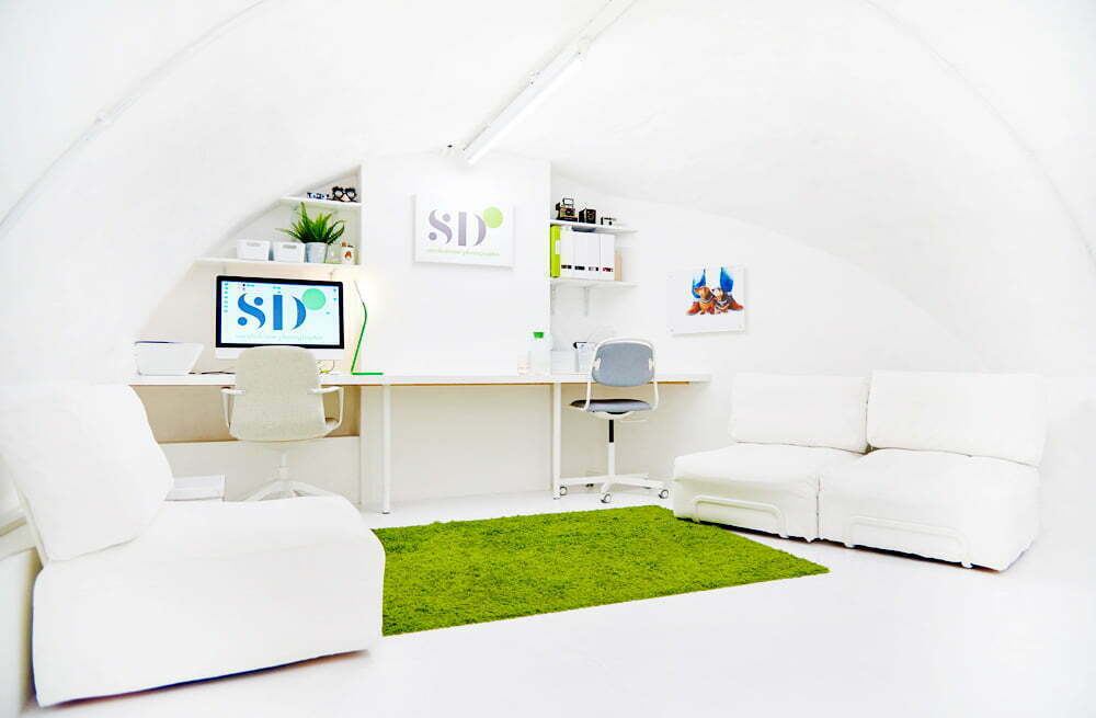
As well as my branding refresh I have refitted my beloved studio with a built in desk space beautifully designed and fitted by A. Lister Carpentry and Joinery, a local lady who knows her stuff when it comes to bespoke office creations in uneven underground whitewashed caves!
Clients often visiting my studio at Clavering House for portrait headshots, comment on how my photo studio looks like a house in Santorini, the bar in an early Star Wars film or an igloo. Whilst young visitors here for family portraits often ask ‘do you live here?’ as it is so cosy and homely. Thankfully there is time after work to go to my real home!
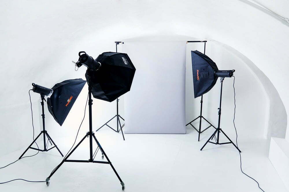
The studio space accommodates website product photography, headshot staff profiles, fashion and family celebrations whether Graduations, Wedding Anniversaries or Bumps and Babies now with even greater ease and I have space for another staff member too! I’ll be updating you on this fab addition soon.
My website has also had a revamp (yes I was VERY busy this June & July!) and has a whole new set of professional/corporate portraiture galleries, featuring Studio Headshots, Staff at Work, Meet the Team and on location portrait photography. I also have afab selection of performer profiles and model portfolio images. Check it out on http://www.sarahdeanephotography.co.uk/professional-portraiture/
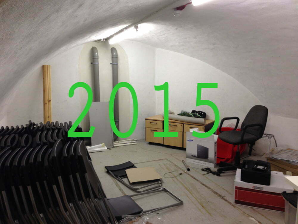
So here are the before and after- from store cupboard in 2015 to a glorious space in its 2018 newness. I am loving it!
The Ultimate Big Cheese Kit Recipes
/0 Comments/in Commercial/by Sarah DeaneThe Big Cheese Making Kit has had such success with it’s easy to follow kits for making a variety of cheeses at home that soon it is to launch the Ultimate Cheese Making Kit! This kit will be the king of cheese making kits and comes with an accompanied recipe book for delicious suggestions as to how to use the home made cheese in savoury and sweet dishes.
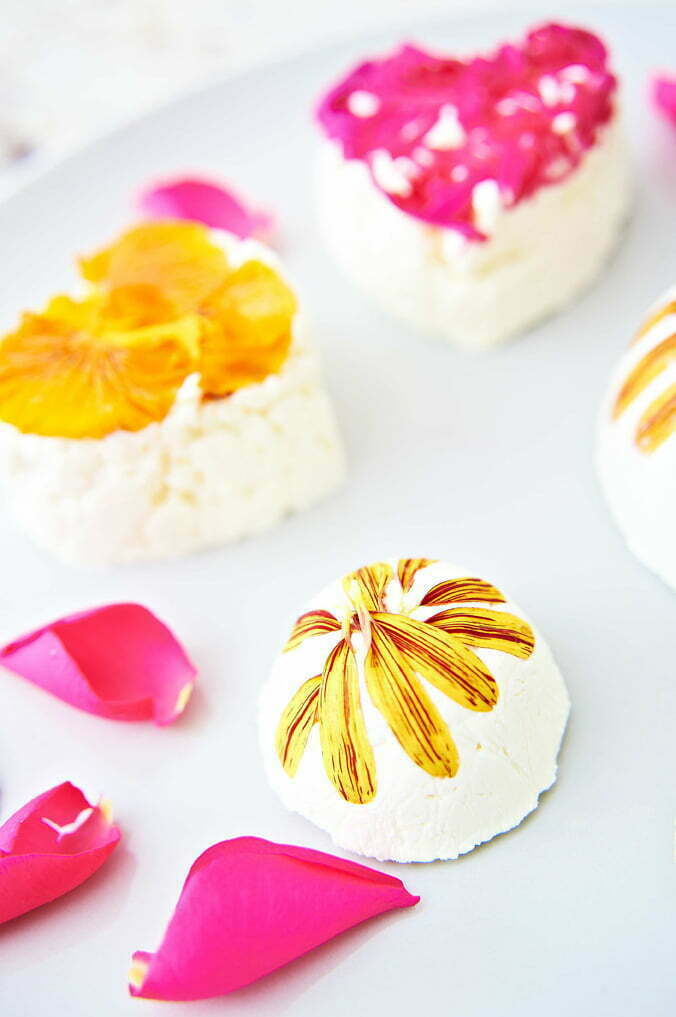
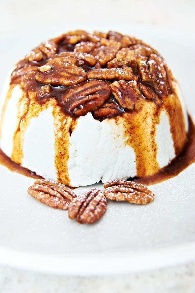
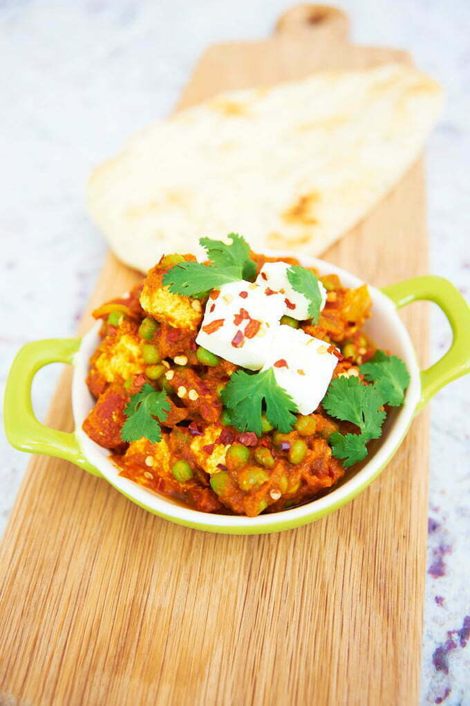
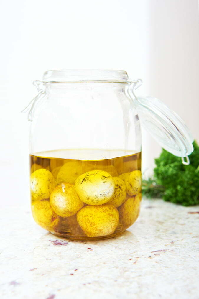
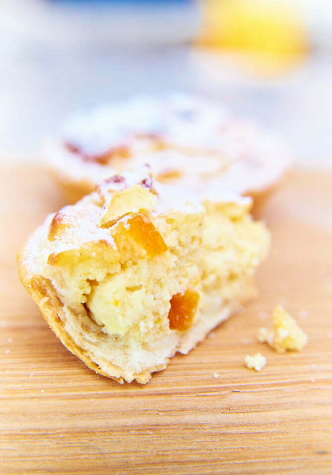
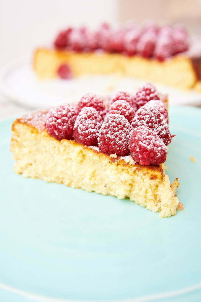
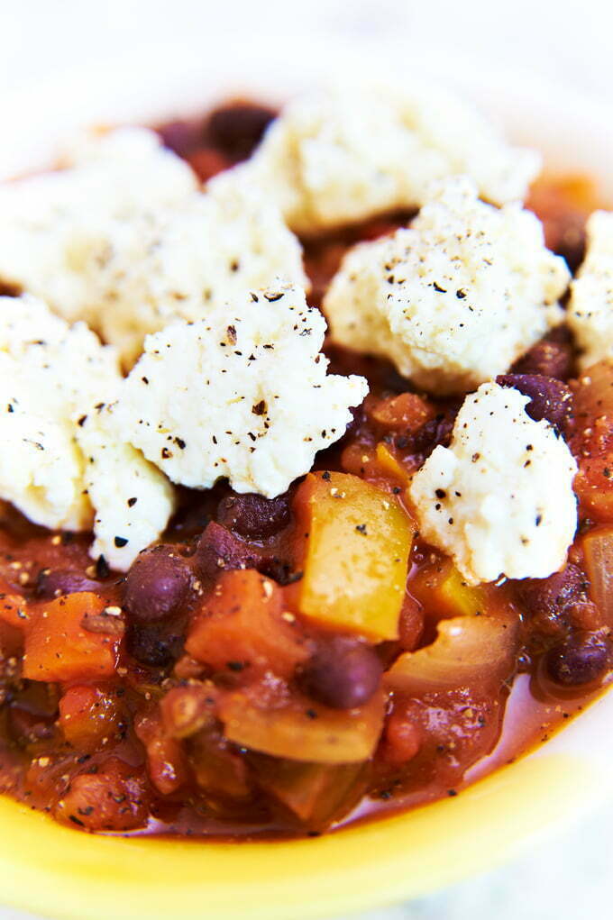
I was up in Edinburgh on location last week shooting food photography images for the home made cheese recipe illustrations in owner Ailsa Proverb’s now famous kitchen and these are samples you see below. The kits are sent worldwide and Ailsa recently received an MBE from the Queen for services to the Food Industry after only a short time in business. Bravo! Say cheese Queenie!
Here are a selection of images from the two days we spent in Ailsa’s fabulous kitchen. Photography tips are below for anyone wanting help and hints on food photography on location.
Macro Lens & Food Photography on Location Photography Tips – The Basics
So my blogs are taking a new angle now as we all know the internet is rather old fashionably known as the ‘information super highway’ so I thought it important to start offering more informative photographic help and tips.
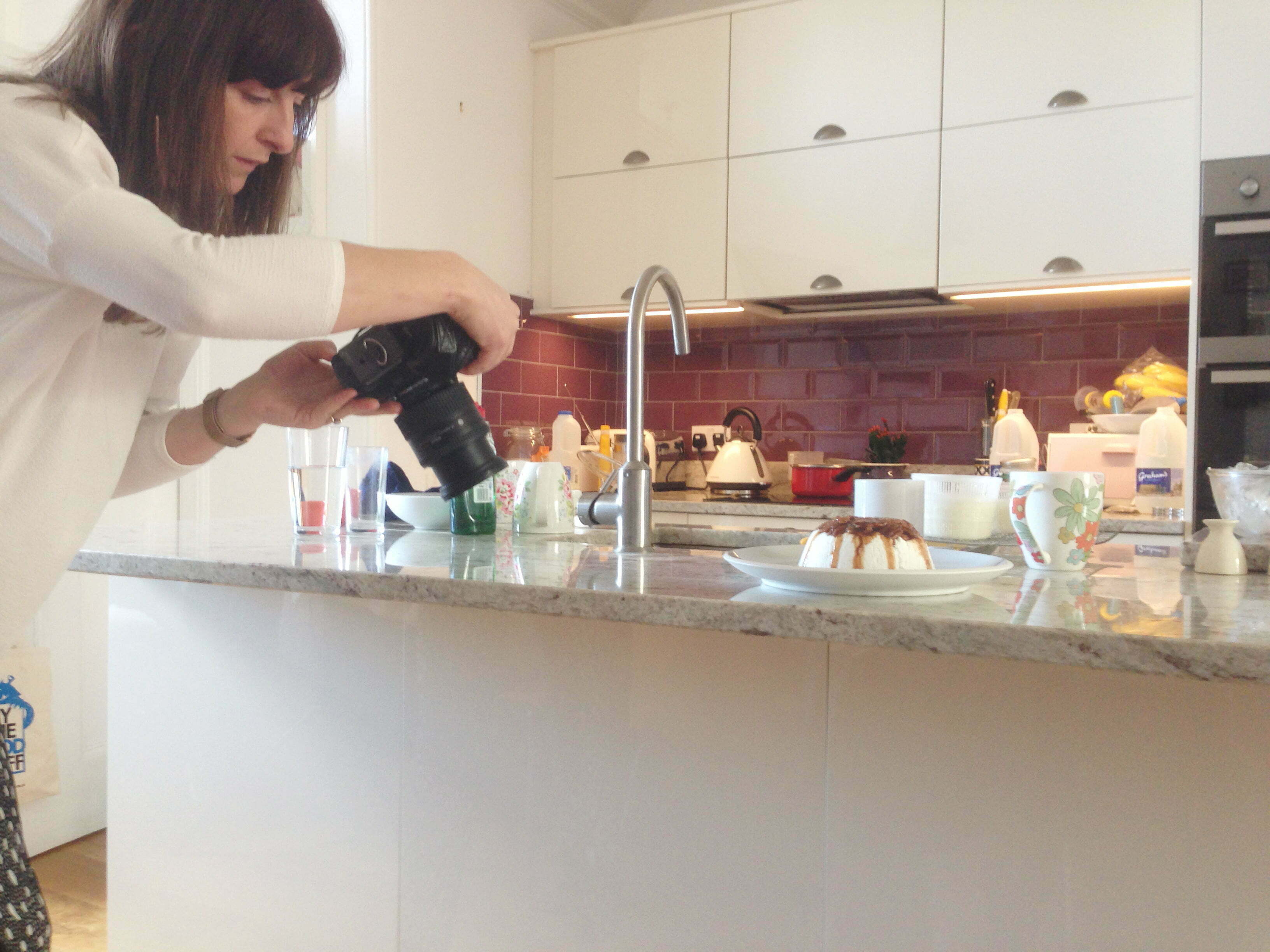
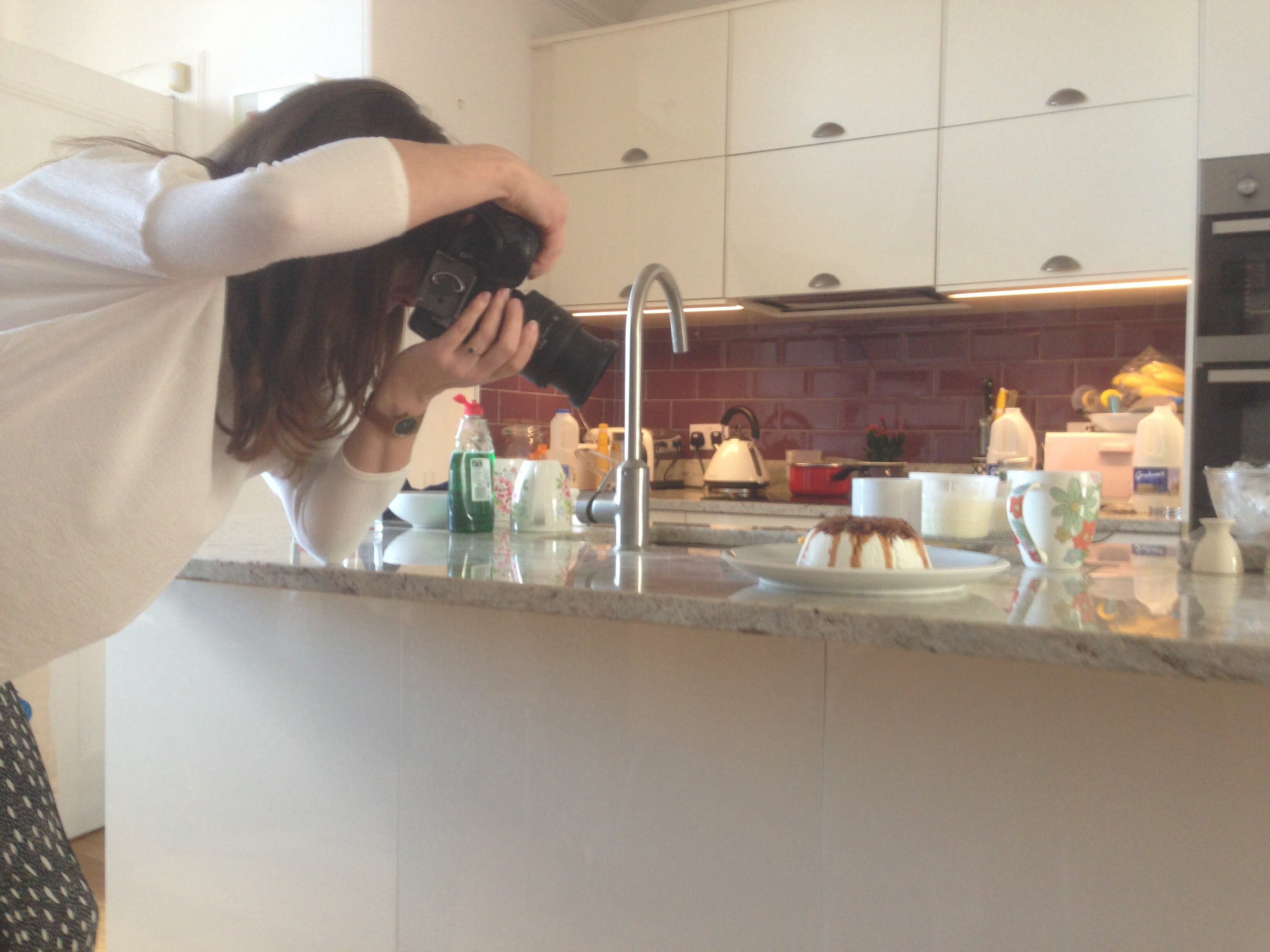
So to set the scene for well lit light and attractive food photography on location I needed elements of studio photography to be taken to the location. I used one flash 400 head with a 1m x .5m soft box bounced onto the ceiling to avoid harsh light bleaching out the white texture of the homemade cheese as much as possible. In terms of kit, I shot with my Nikon D700 (full frame) and I used my 24-85mm Nikon lens with built in macro to get detailed mouthwatering close ups of the ingredients. I shot on macro setting throughout and used the zoom on full 85 for some close up compositions.
Food photography really benefits from a shallow depth of field, so an f-stop of around 2.8 to 3.5 will give you the sharp focus and extreme blur in one shot. My shutter speed was 125 and ISO was 250 fairly statically as the flash head kept light constant despite the nearby window. Try not to rely on natural light as you will be struggling with setting changes if the sun goes behind a cloud. But do try to mimic the way that natural light can cast gentle shadows from a natural source like a window. NB when using shallow depth of field, you must be careful to highlight the correct part of the food in the photo and for this we had the mantra that ‘cheese is king’!
Ailsa’s colleague Alison had prepped most of the food the day before as most would be typically served cold or cool. This takes the pressure off as hot food wilts and hardens as it cools and becomes unattractive so the window to shoot is much smaller. We also had carefully chosen props with subtle shades with small splashes of colour on the crockery for the styling. So the prep had been paramount to the success of this shoot.
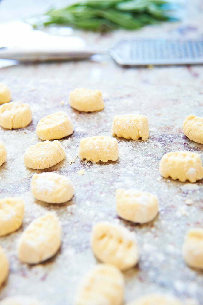
If you are doing lots of close ups then it’s a lot easier to work in a location environment as little of the backdrop will be included, so a little mess can be allowed! If you want some backdrop blur of the natural environment then remove any strong coloured items that may distract from the food, particularly red. You can also have relevant props blurred as I did with the Gnocchi shot leaving the parmesan grater in the backdrop. The macro lens was used throughout this two day shoot as it will enhance the recipe book by helping the reader identify the ingredients easily and imagine how it might feel and taste in the mouth as they eat it. You can get in really close and select the most attractive part of the dish. There is a lot of experimentation with this type of photography so it is a lot more time consuming that most. Although as you image extremely rewarding too!
Dylan Thomas, Love the Words
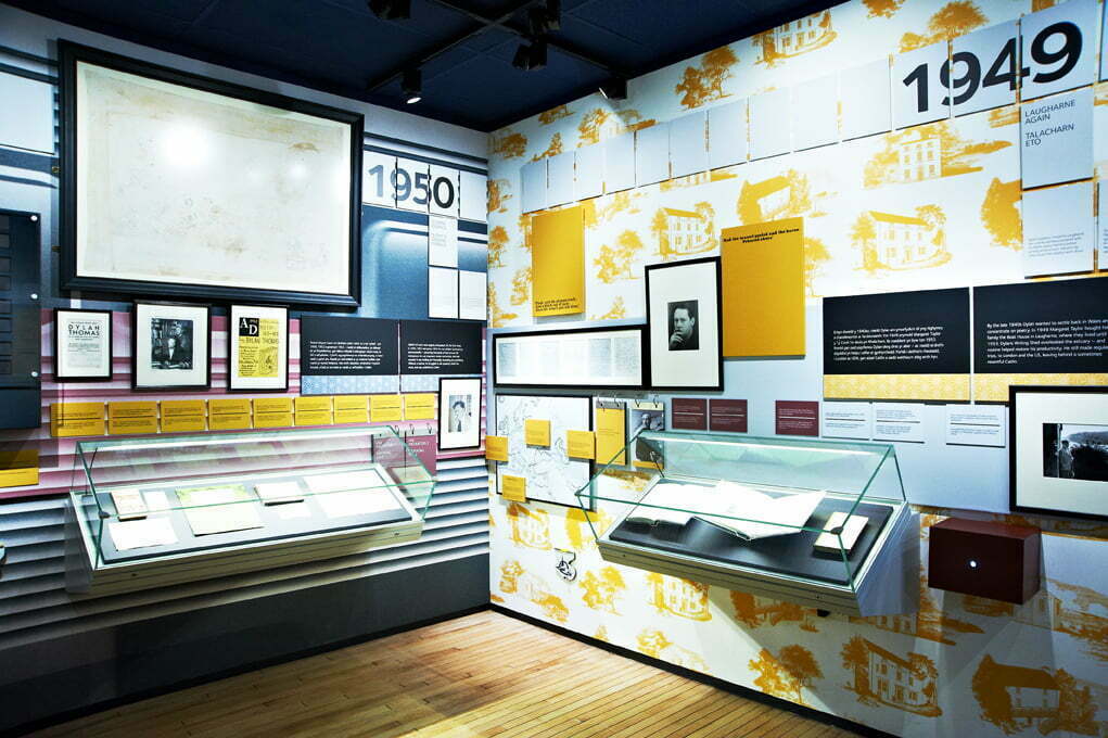
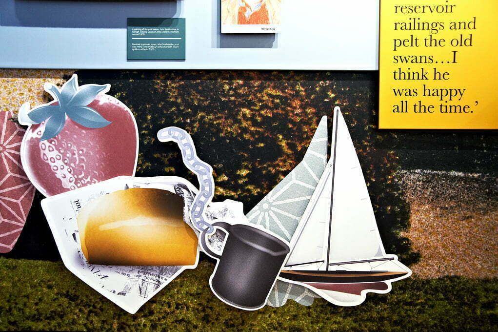
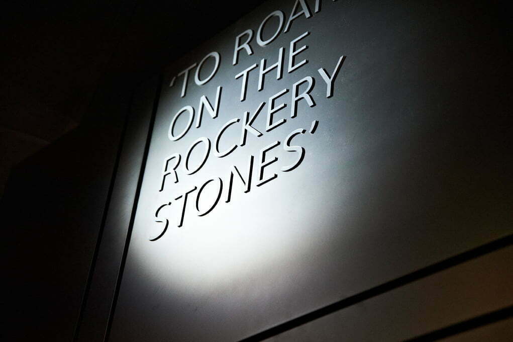
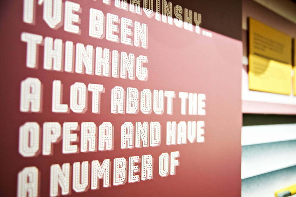
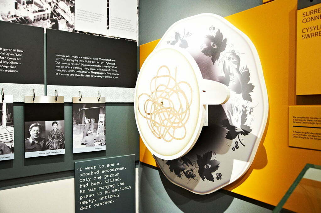
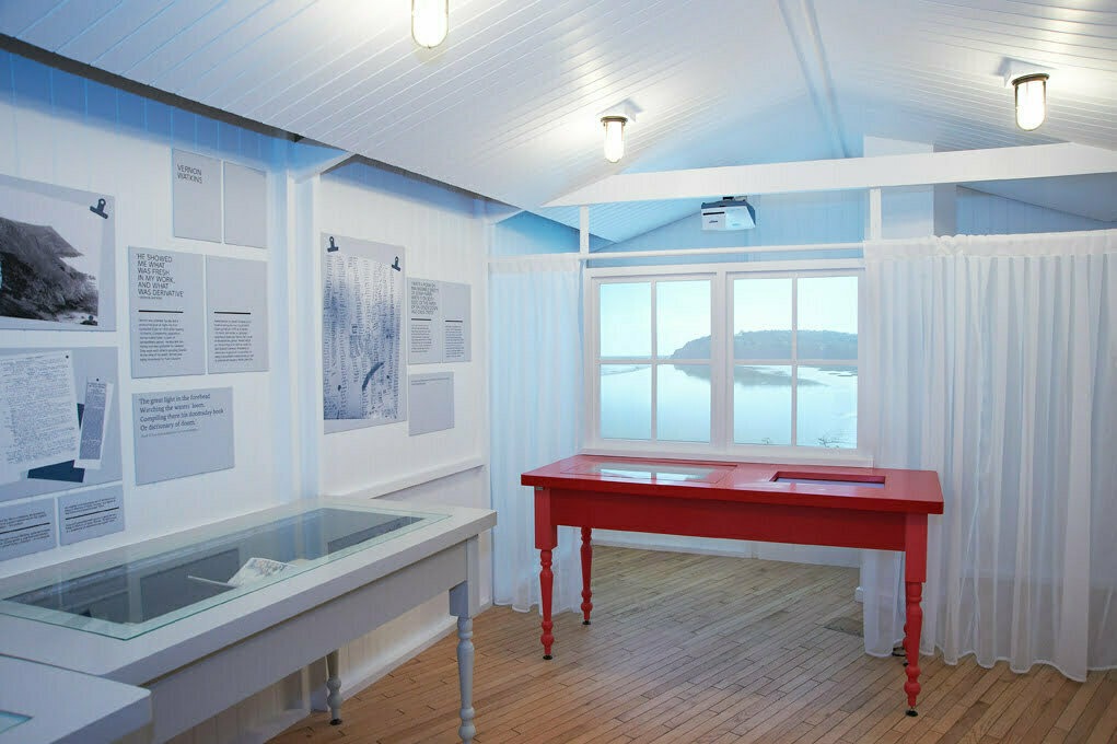
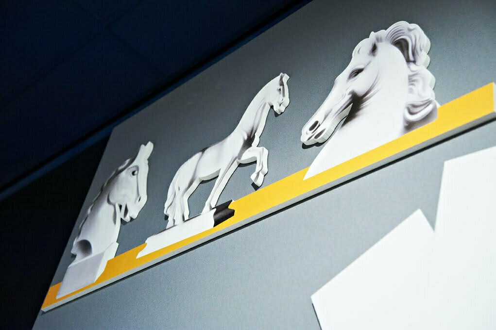
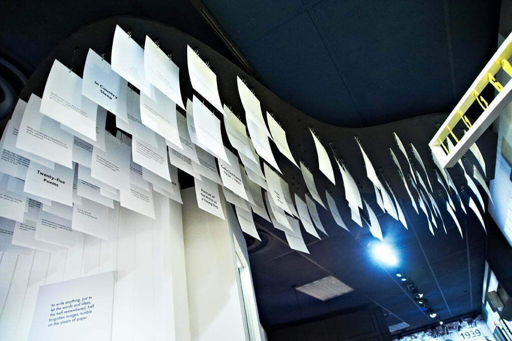
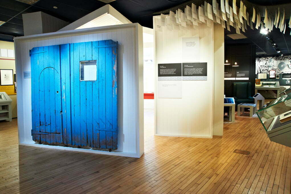
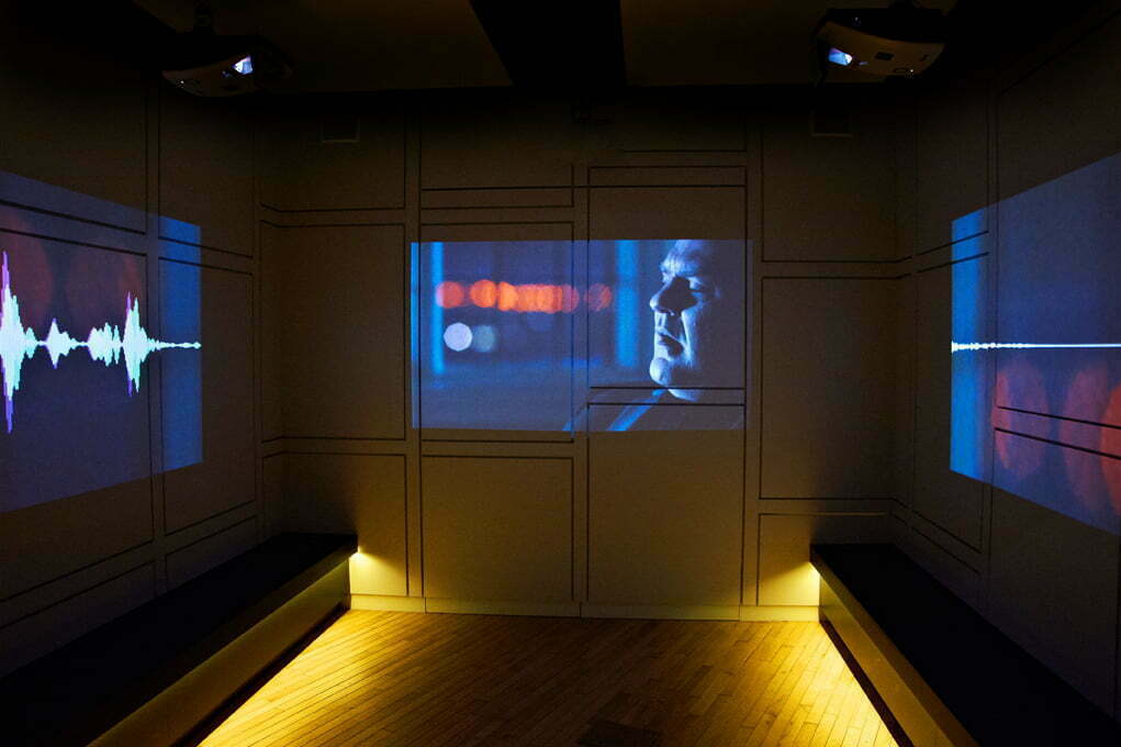
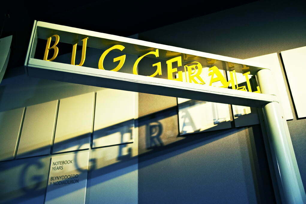
/0 Comments/in Commercial/by Sarah DeaneSo here is another set of images recently captured for my London based client Studio hb who specialise environmental graphics for exhibition spaces. The exhibition is a recently refurbished permanent exhibition at the Dylan Thomas Centre in Swansea. It is fully interactive with touch screens, spy holes, neon, sound and projections together with beautiful typefaces, a minimal colour palette and cartoon-like illustrations.
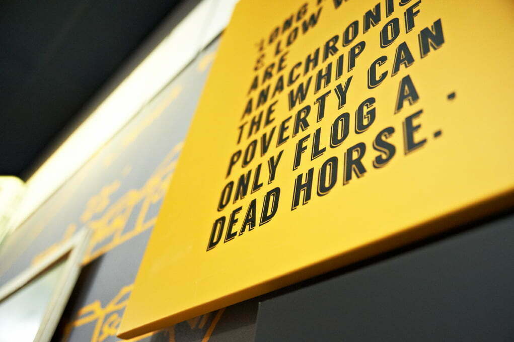
The designers have chosen to create a space that is low lit, playful and intriguing and so my environmental photography needed to capture this atmosphere and the design details. The photographic brief was to document the main elements of the environmental design, much like the David Bowie is and Olympic Journey 2012 exhibition where I photographed close ups on print finishes and materials, video projections, text and creative interactive elements.
Photography tips. How to!
How do you shoot correctly exposed images in low light exhibition spaces?
So to give advice on how to capture an exhibition in this type of a low light environment, because the subject matter is stationery you can take down your shutter speed really low without any risk of movement blur providing you use a tripod. So a tripod is a fundamental bit of kit for this type of shoot. The ISO can be anything up to 1600 and maybe higher to 2500 with a camera body that copes well in low light but mainly use a tripod so you can maximise light instead with a very slow shutter speed like 10 or under. This way you avoid the grain often present in a slightly under exposed image shot at a high ISO.
If you are creating atmosphere, be careful to note the level of light in the room and avoid over exposer as you will lose atmosphere with a brightly lit image. You may also like to use a remote to avoid any camera shake when pressing the shutter. Spot lights may cause issues with over exposure so keep an eye out for highlight warnings in your camera as you shoot. Below are samples of the various areas of the exhibition with many different lighting challenges with projections and spots.
New Studio Premises
/0 Comments/in Commercial/by Sarah DeaneI am in. Hurrah!
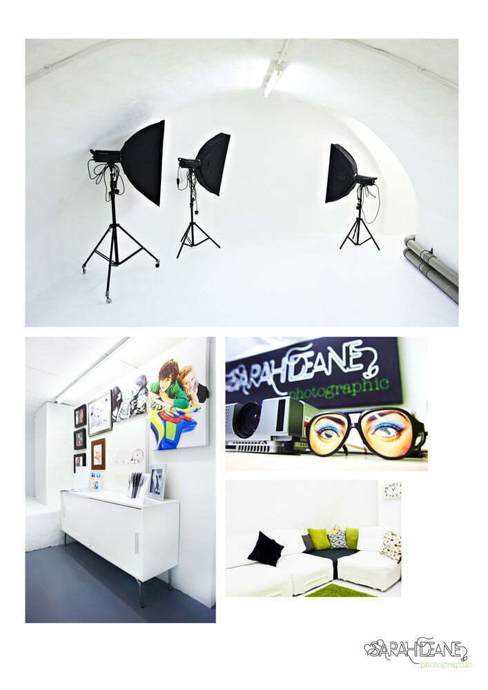
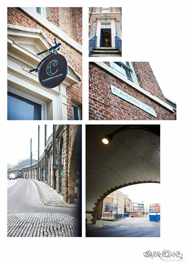
So two weeks, a few broken fingernails and 15 litres of paint later my new studio is looking tip top! The new space is situated in Clavering House which many people know as the old Robson Brown premises in Newcastle city centre. I am near Central Station and iconic landmarks like the High Level Bridge and the Castle Keep so it is a beautiful area of town to work.
The studio has a cave-like feel as it’s all underground it’s full of curves, arches and exposed stone. I have painted it fully white for flexible shooting area and have various Coloramas too. It’s perfect for portraiture, commercial shoots, fashion and much more! For any budding photographers in Newcastle, students or professionals without a space, the equipment can be hired by the hour at competitive rates so you just have to bring your camera. Drop me a line at sarah@sarahdeanephotography and ask for more info on hourly hire at my Newcastle photography studio.
The move also marks Sarah Deane Photographic’s 4th birthday which is really exciting! As beautiful as my last premises were in Kingsland Church in Byker I really needed a central location to take my business into it’s 5th year and beyond. I shall be celebrating with an open evening in April (date TBC) and will invite clients, local businesses and friends to come and see the new space with wine, beer and a chance to win a print. More details to follow!
Bellow is a sneak peek….
